What Color Should the Sharpener's Logo Be? Help Us Decide

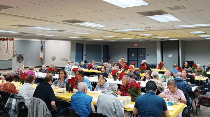
At Liberty Fest on July 2, the Sharpener's booth was mobbed by adorable toddlers and elementary kids, many asking, "Can I vote?"
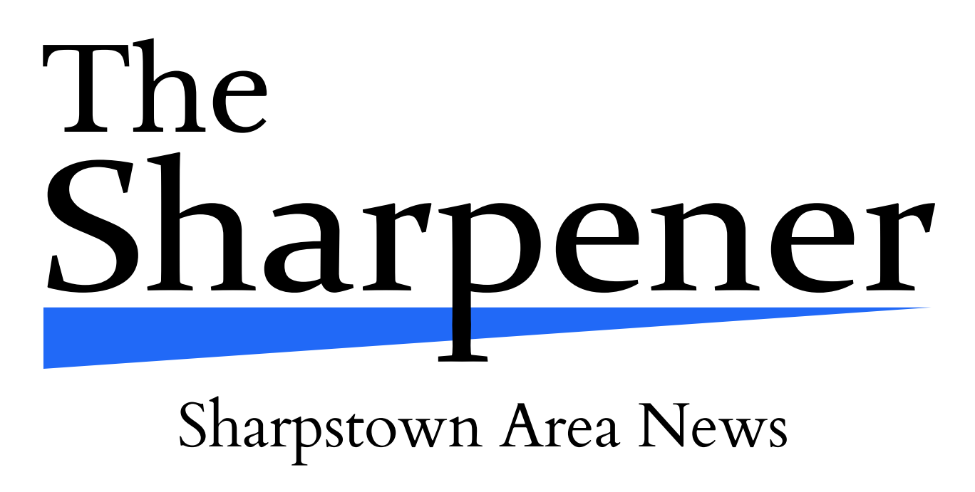
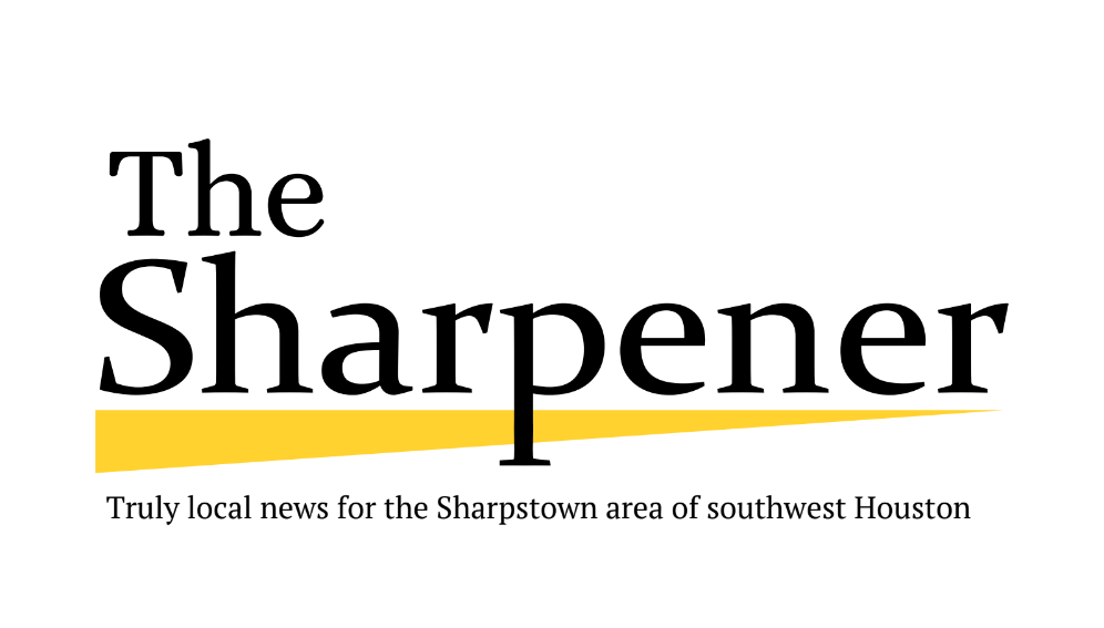
We want the Sharpstown community to vote on the color of our new logo, designed by our intern Ana Garcia.
At Liberty Fest, we had a multicolor logo display and a tri-fold whiteboard that read "Vote for Candy." But some of the kids seemed more excited about the voting than the candy. I guess they're already natural American citizens.
Don't worry--adults can vote too. (But we're not offering candy anymore.)
What we are offering is the chance to help shape the future look of the Sharpener.
Take a look at the logos below and tell us which color you like best. Just subscribe for free to comment on this post! If you've already subscribed, you can comment as long as you're signed in.


Here are the voting results so far, added up from Liberty Fest and online comments:
- Blue: 30
- Purple-Green: 23
- Yellow: 13
- Blue-Green: 11
- White: 7
- Green: 7
- Purple (not shown): 5
- Black: 5
- Red (not shown): 4
- Pink (not shown): 2
- Gray: 1
About three quarters of those votes are from adults, one quarter from kids.
Don't miss your chance to vote by commenting below!
Comments ()